
Colour Cards
In the early part of the twentieth century most face powders, lipsticks and rouges came in a limited number of shades. The colours were generally identified descriptively by names such as Rachel, Natural, Peach, Flesh and White for powder or Light, Dark, Tangerine, Geranium, Cherry, Vivid and Crimson for lipstick and rouge. Eye make-up colours were even more limited, usually restricted to blacks and browns for eyebrows and eyelashes, and blues, greens and greys for eyeshadow.
There was no guarantee that make-up produced by different firms sold under the same shade name was identical in colour but the limited colour choices and recognisable tint names made selecting a suitable shade of make-up a fairly simple process. There was limited scope for colour coordination – generally restricted to matching lipstick and rouge – and many cosmetic companies made this easy by giving their matching lipsticks and rouges the same shade names.
See also: Colour Coordination
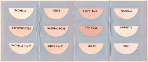
During the 1920s shade ranges grew as cosmetic companies took suntanned skins into account. A number of these new darker shades took on descriptive names like Aureate, Sunburn, Copper and Ocre but by the late 1920s the earlier colour naming conventions – which were weak at best – were being discarded for names with more marketing appeal. In 1928, for example, Elizabeth Arden sold more than a dozen shades of face powder; some like White, Naturelle, Rose and Rachel had descriptive names but others like Illusion, Lilas, and Minerva did not.
Although women had more choice, the wider shade ranges and the decline of descriptive names meant that choosing an appropriate shade of powder, lipstick or rouge became more difficult, a situation complicated by the trend for coordinating make-up with clothing colours. There were some calls for colour standardisation to make identification easier but this was a lost cause.
The view has been expressed that certain tints, known by what may be called “standard” names, should be absolutely standardised. For example, if a woman asked for rachel powder, she should get exactly the same tint, no matter what the brand.
This policy would not be acceptable to the cosmetic industry as a whole. It would handicap enterprise, limit novelty, and deprive the manufacturer of one of his most potent sources of appeal.
At the same time, it seems only reasonable to require that such names as “rachel,” “naturelle,” “peach,” “sunburn,” etc., should connote definite ranges of shades. Actually … this is not always the case. One firm, for example, offers a “rachel” which differs only slightly from another firm’s “naturelle”; and both tints would perhaps be more correctly denominated “peach.”(Redgrove, 1933, p. 135)
To help women select suitable colours, cosmetic firms began to turn to a visual solution long used in the textile, paint and other trades, namely swatch cards.
Swatch cards
In the textile trade, swatch cards were used to display the range of fabrics companies made or sold. Constructed using real samples of fabric to ensure that the customer knew precisely what they were buying, they were used by travelling salesmen or jobbers on their rounds but could they could also be sent by post to potential or long standing customers.
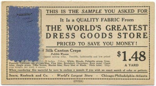
Above: 1926 A Sears Roebuck and Co. sample card posted to a customer containing a single swatch of fabric.
As well as swatches of finished cloth, these cards were also used by synthetic dye companies to send samples of different fabrics coloured with their dyes.
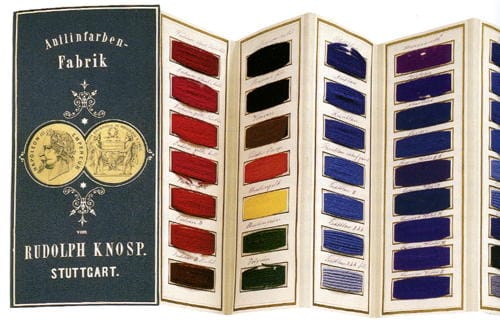
Above: 1869 Colour handbook of aniline dyes marketed by Rudolph Knosp., Stuttgart. The handbook contains real samples of different textiles dyed in a range of colours (Blaszczyk, 2012).
When the idea of colour cards was taken up by cosmetic companies to display shades of make-up, some followed the example of the textile trade and used real make-up to create them. Max Factor, for example, created a colour card of his face powders in the 1930s by sticking samples of actual powder to card, presumably making sure that the glue did not affect the colour.
Above: Max Factor Color Harmony Shades from the early 1930s. Face powder has been applied to half circles of card which were then arranged into a small folding booklet. A neutral grey background has been used to detract as little as possible from the shade colours.
Also see the company booklet: Max Factor Hollywood Color Chart
Printing advances
Unlike fabrics, making colour cards using real samples of powder, rouge or lipstick was not a viable proposition in most cases. Unfortunately, printing shade cards using colours that matched make-up was not without its problems.
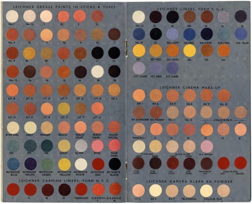
Above: 1938 Leichner colour chart produced as part of a promotional booklet.
Even though colour reproduction improved during the 1930s, most shade cards were generally made by individually printing a sheet of each tint – colour matched by trial and error – then die-cutting out individual pieces which were then stuck to cards. Shade cards made this way were laborious to make and expensive, so in most cases their use was restricted to wholesale brochures, point of sale booklets or counter displays.
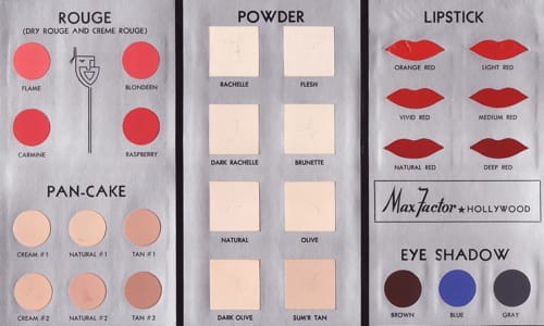
Above: Max Factor Color Chart from the late 1930s. This colour chart was probably released around 1937 when Pan-Cake was first introduced. Using a combination of real make-up and printed colours, each colour of rouge, pan-cake, powder, lipstick and eyeshadow has been created separately, die-cut and the pasted onto a card with a neutral grey background.
After the Second World War it became easier to print a large number of colours directly to card and to get better colour matching. This made the customary method of printing each colour separately obsolete, dramatically reducing printing costs.
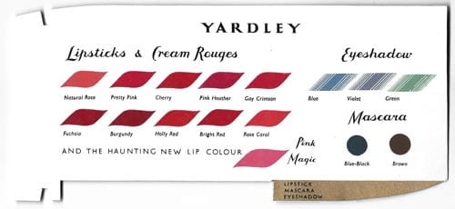
Above: 1956 Yardley Shade Card printed directly to paper.
Printing firms such as McCorquodale & Co. Ltd. in Britain and Pantone Press in the United States could now direct print colourful showcards and other advertising material displaying the shade ranges of a particular line of make-up.
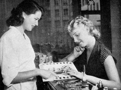
Above: 1950 Sales assistant using a Pantone Press colour card to demonstrate the available shades of Revlon Nail Enamel.
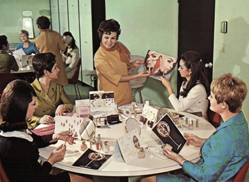
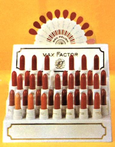
Above: 1967 Max Factor sales training meeting with a range of promotional materials containing shade charts.
Also see the company booklet: New Make-up Color Fashions by Max Factor
Ultimately, much of this loose paper-based material would be replaced with other more eye-catching displays. Advances in the manufacture of plastics and the move to self-service would see colour charts being superseded by three dimensional plastic reproductions or being built into self-service display stands.
Updated: 12th August 2017
Sources
Blaszczyk, R. L. (2012). The color revolution. Cambridge, MA: MIT Press.
Poucher, W. A. (1932). Perfumes, cosmetics and soaps (4th ed., Vols. 1-2). London: Chapman & Hall, Ltd.
Redgrove, H. S. (1933). Colour control in the cosmetic industry. The Manufacturing Chemist. May, 135-139.
Sipley, L. W. (1951). A half century of color. New York: The Macmillan Company.
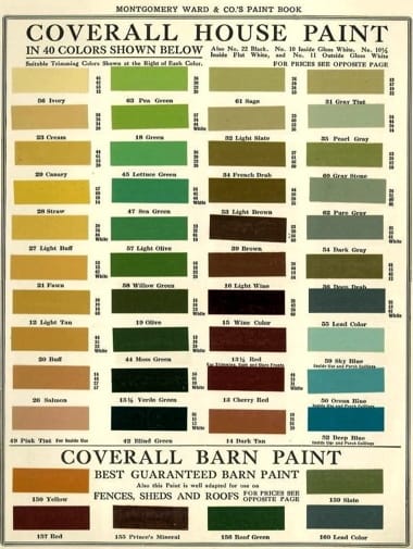
1915 Montgomery Ward Coverall Paints Colour Chart.
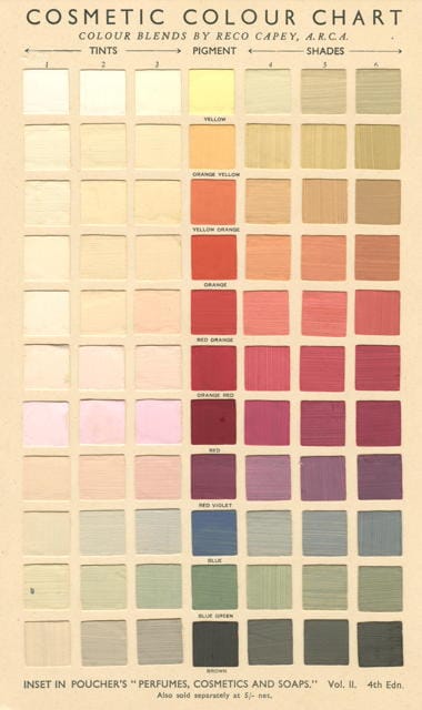
1932 Reco Capey Cosmetic Colour Chart. Included in Poucher’s book to help cosmetic chemists arrive at a given colour, the chart was made from hand painted colours cut into squares and attached to a card (Poucher, 1932).
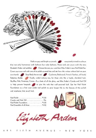
1939 Elizabeth Arden. The advertisement shows a nail colour fan made from plastic. Individual colours could be placed over the nail plate so that a customer could imagine how they would look on her hand. As nail polish could be applied directly to the plastic these would not have to be printed.
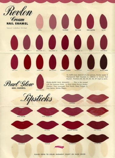
1940 Revlon Colour Chart for Cream Nail Enamel and Lipstick. Like other similar charts the colours were printed in shapes that matched the body part on which the make-up was used rather than the rectangles or squares used for paint and textiles.
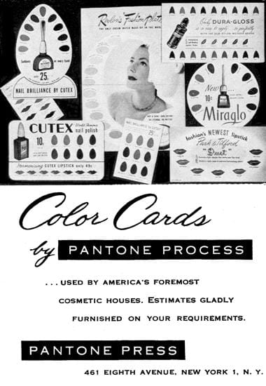
1959 Colour Display Cards by Pantone Press. Pantone Press first manufactured cards to show lipsticks and nail enamel shades in 1950.
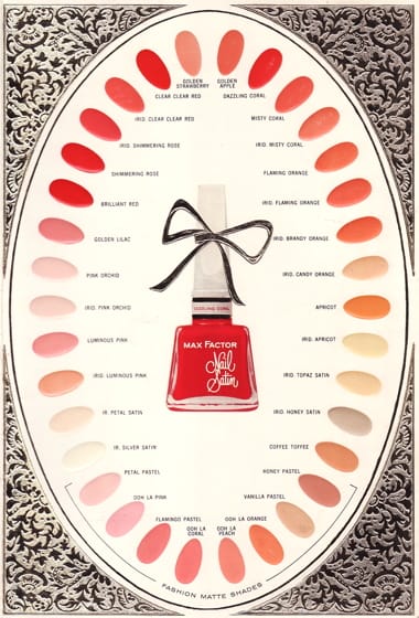
1961 Max Factor Nail Satin colour range. This was part of a small booklet.
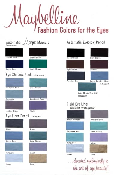
c.1961 Maybelline Fashion Colors for the Eyes. This was part of a small booklet.
1964 Max Factor display unit. Three dimensional units like this made from plastic were more effective than traditional colour display cards at promoting colour ranges for lipsticks and nail polishes.
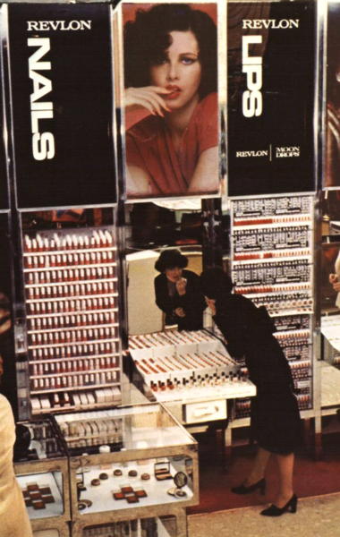
1976 Revlon self-service display module. A woman is trying on a lipstick using a tester in a manner that would not be allowed today. The massed product display of Revlon nail enamels in clear containers enables them to act like a colour card making selection easier. Where products do not allow for this, because of their size or packaging, colour charts are incorporated nearby into the display case.